Does Size Matter? Top 5 Sizing Tips for Accessible Design
TL;DR: Five science-backed sizing principles every designer should know: limit content width to 1200-1500px, make touch targets at least 44px, use 16px+ body text with clear hierarchy ratios, keep lines to 45-75 characters, and space interactive elements 8px+ apart. These aren’t arbitrary rules—they’re based on decades of research into human vision, motor control, and cognition.
Understanding proper sizing in digital design isn’t just about aesthetics—it’s about creating interfaces that work for everyone. These five evidence-based principles will help you make sizing decisions that improve usability and accessibility across your designs.
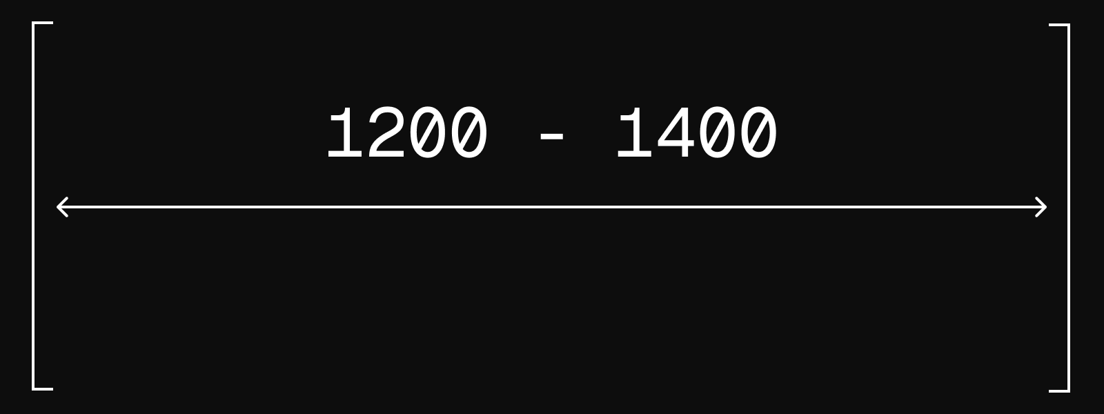
1. Optimize Content Width for Visual Comfort (1200-1500px Maximum)
The Challenge: Wide content areas can cause visual fatigue and reading difficulties, particularly on large displays.
The Research: Human central vision processes detailed information within an 18° field of view. At typical desktop viewing distances of 60-100cm, this corresponds to optimal content widths of approximately 1300-1500px. Beyond this range, users must make excessive eye movements to track across content, increasing cognitive load and reading fatigue.
Vision science research shows that the foveal region—responsible for sharp, detailed vision—covers only about 2° of the visual field. The broader 18° zone represents the area where the brain can process information efficiently without requiring deliberate eye movement.
Design Application:
- Set maximum content widths between 1200-1500px for optimal readability
- Consider using multi-column layouts for very wide displays rather than stretching content
- Test your designs on various screen sizes to ensure comfortable reading experiences
- Center content containers to balance white space on larger displays
Implementation Note: This principle applies primarily to text-heavy content. Visual content like images or data visualizations may require different width considerations based on their specific requirements.
2. Design Touch Targets for Real-World Interaction (44px Minimum)
The Challenge: Small interactive elements lead to interaction errors and user frustration, particularly on mobile devices.
The Research: MIT Touch Lab research established that average human fingertip width ranges from 16-20mm. The foundational University of Maryland study by Parhi, Karlson, and Bederson (2006) tested 20 participants with target sizes from 3.8mm to 11.5mm, finding optimal performance at 9.2mm for discrete tasks and 9.6mm for serial tasks.
WCAG 2.1 established 44×44px as the minimum requirement for Level AAA accessibility, while platform design systems have evolved to recommend larger sizes: Google Material Design specifies 48dp, acknowledging that user comfort improves with more generous sizing.
Design Application:
- Ensure all interactive elements meet the 44×44px minimum requirement
- Use 48×48px when possible for improved usability
- Consider the surrounding context—isolated buttons can be smaller than buttons in dense interface areas
- Account for different interaction modes: thumb interaction requires larger targets than index finger interaction
- Test designs on actual devices rather than relying solely on desktop previews
Accessibility Impact: Proper touch target sizing benefits users with motor impairments, older users experiencing age-related changes in dexterity, and anyone using devices in challenging conditions.
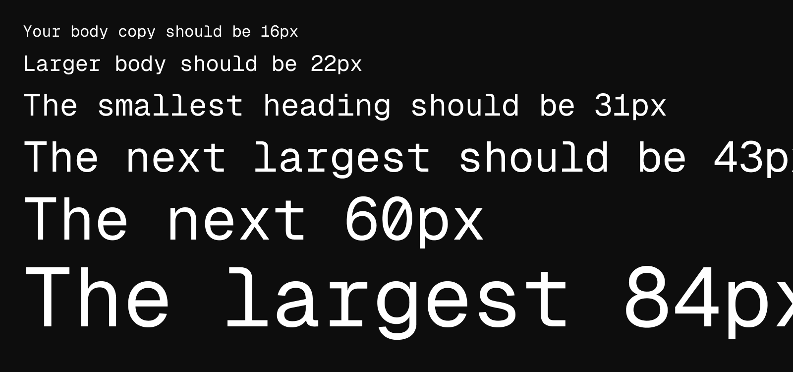
3. Establish Clear Typographic Hierarchy (16px Baseline with Meaningful Ratios)
The Challenge: Poor typographic hierarchy creates confusion and reduces content comprehension.
The Research: Studies show that reading from screens is approximately 30% slower than reading printed materials, making clear hierarchy essential for digital interfaces. Research in visual perception indicates that size differences must have ratios of at least 1.2:1 for reliable recognition, though 1.4:1 ratios provide better differentiation.
The University of Central Florida’s Readability Consortium found that appropriate typeface selection and sizing can improve reading speed by 35%.
Design Application:
| Element | Conservative (1.2 ratio) |
Clear Differentiation (1.4 ratio) |
|---|---|---|
| Body text | 16px | 16px |
| Large body | 19px | 22px |
| H4 | 23px | 31px |
| H3 | 28px | 43px |
| H2 | 34px | 60px |
| H1 | 40px | 84px |
Implementation Guidelines:
- Never use body text smaller than 16px for primary content
- Increase font sizes for mobile interfaces where screen distance is typically closer
- Consider your audience demographics when choosing between conservative and bold scaling
- Maintain consistent ratios throughout your design system
- Test hierarchy effectiveness by reviewing content at various zoom levels
4. Control Line Length for Optimal Reading (45-75 Characters)
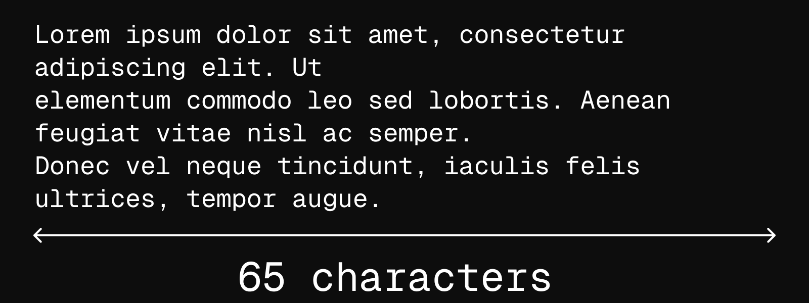
The Challenge: Lines that are too long or too short disrupt reading flow and comprehension.
The Research: Robert Bringhurst’s “Elements of Typographic Style” established the foundational 45-75 character guideline, with 66 characters considered optimal. Modern digital reading research by Dyson and Haselgrove (2001) found that 55 characters per line produced superior comprehension scores, while longer lines increased reading speed but decreased understanding.
This creates a crucial design consideration: optimizing for reading speed versus comprehension based on content goals and user needs.
Design Application:
- Desktop interfaces: Target 60-80 characters per line for body text
- Mobile interfaces: Aim for 30-40 characters per line
- Multilingual considerations: For CJK languages (Chinese, Japanese, Korean), WCAG guidelines specify 40 characters maximum due to character density
Measurement Technique: Use the ‘ch’ unit in design tools when possible, as it represents the character width in the current font, providing more accurate line length control than pixel-based measurements.
Content Strategy: Consider breaking very long content into sections or using progressive disclosure rather than forcing users to read extremely long lines.
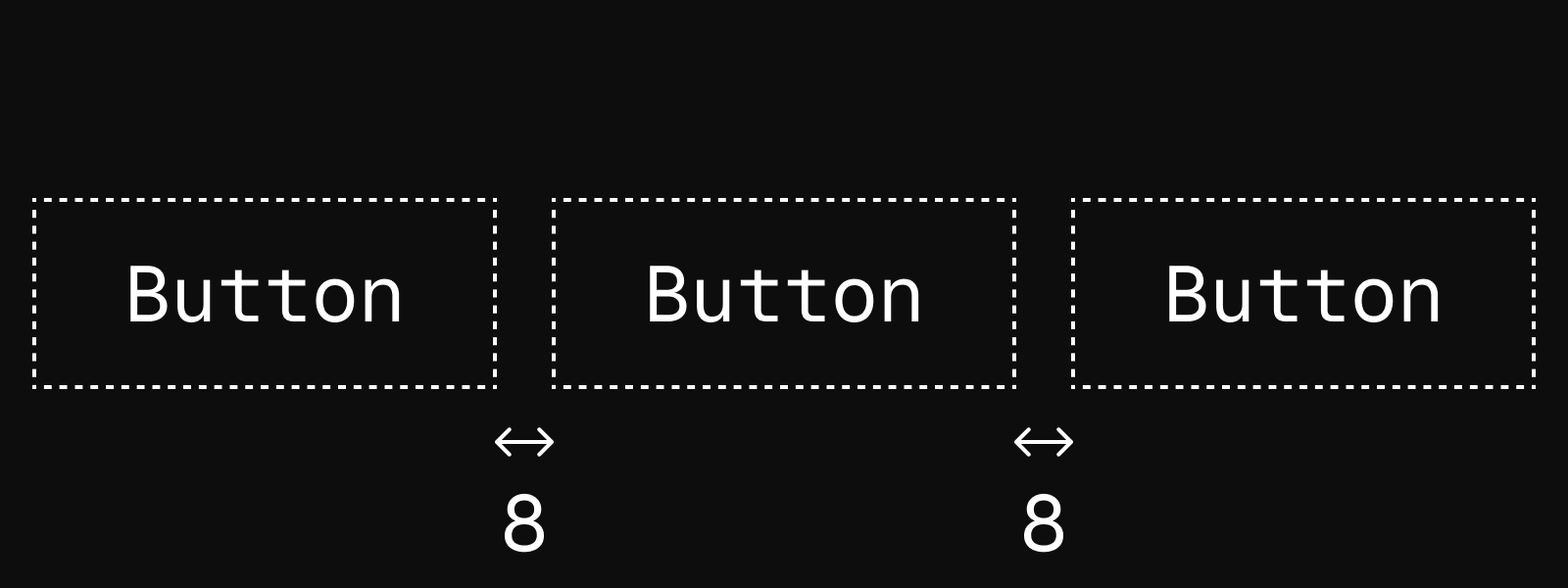
5. Provide Adequate Spacing Between Interactive Elements (8px Minimum)
The Challenge: Closely spaced interactive elements increase error rates and task completion time.
The Research: Fitts’ Law demonstrates that target acquisition time increases when targets are smaller or closer together. Microsoft research specifically found that 7.5mm spacing between touch targets significantly reduces mis-taps and improves user confidence in interface interaction.
This principle becomes particularly critical in mobile interfaces where interaction precision is naturally lower and the consequences of mis-taps can be more significant.
Design Application:
- Minimum spacing: 8px between all interactive elements
- Comfortable spacing: 12-16px for improved usability
- Critical actions: Use generous spacing (16px+) around destructive or high-consequence actions
- Contextual considerations: Dense interfaces like data tables may require creative solutions to maintain spacing while preserving information density
Design Strategy:
- Group related actions together and separate them from unrelated actions
- Use visual hierarchy to distinguish between primary and secondary actions
- Consider the interaction flow—frequently used action pairs should be optimally spaced for efficient task completion
- Test spacing decisions with real users performing actual tasks, not just visual reviews
Final thoughts
The size of elements is fundamental to creating usable digital design. Take these evidence-based principles into consideration, and you’ll create designs that feel effortless, accessible, and professional—where users can focus on their goals rather than fighting with your interface.